BRIGHT GEOMETRY

Client: Potatoes U.S.A

Photographer:Rachel Adams

The One Club Denver Bronze Winner – Craft/Photography

Problem: Potatoes don't have a photography problem — they have a relevance problem. The brand needed a visual language that felt made for a Gen Z audience, not a grocery circular.

Solution: Forget food photography conventions. Apply graphic design logic to the shoot instead.

Idea: Bright Geometry — bold color blocking, structured ingredient patterns, and tight compositions that treat the potato like a design element, not a side dish.

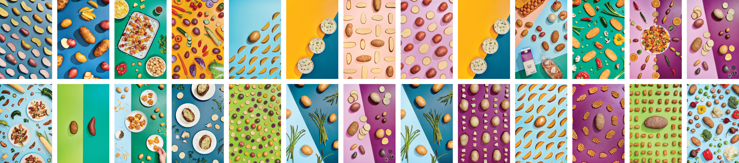
Execution: Full art direction development across concept, color systems, composition frameworks, and ingredient styling — translated into a production shoot with photographer Rachel Adams.

Impact: Established a distinctive visual language for the brand that earned a One Club Denver Bronze in Craft/Photography.

My Role: Led concepting and art direction for the shoot — color systems, composition rules, ingredient styling — and assisted with on-set direction.